A bedroom should feel like a quiet retreat, a place where the day naturally slows down and the body knows it is time to rest. I have noticed that color plays a powerful role in shaping that atmosphere, far more than most people realize at first glance. The shades on the walls, the bedding, and even the small accents around the room can either calm the mind or keep it subtly alert. After experimenting with different palettes and paying attention to how each one affects my sleep, I have found that certain colors consistently create a more peaceful and restorative environment.
Why Color Influences Sleep Quality
Color is not just a visual detail; it has a direct psychological and physiological impact. I have felt how certain shades can instantly shift my mood, even without changing anything else in the room. Soft, muted tones tend to relax the nervous system, while bold or overly bright colors can create a sense of stimulation that lingers longer than expected.
The brain processes color through associations and emotional responses. Cool tones often remind me of nature, like the sky or water, which naturally brings a sense of calm. On the other hand, intense colors like bright red or neon shades feel energizing, almost like they are pushing the mind to stay alert. This connection between color and emotion becomes especially important at night, when the goal is to ease into rest rather than stay engaged.
Lighting also plays a role in how colors are perceived. A shade that feels soothing during the day might appear completely different under artificial lighting at night. I always consider how a color looks in both natural daylight and warm evening light before committing to it, because that shift can either enhance or disrupt the relaxing effect I want.
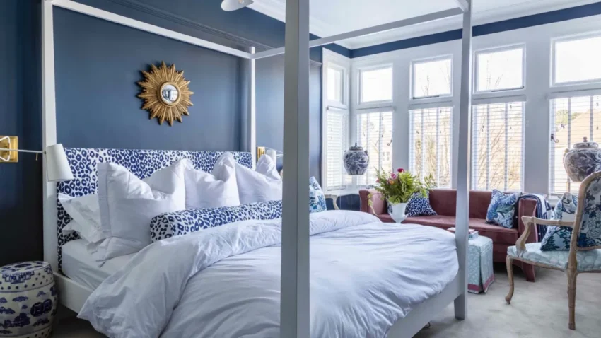
Soft Blues That Calm The Mind
Blue is one of the most reliable colors I turn to when aiming for a sleep-friendly space. There is something about it that feels naturally calming, almost like stepping outside and looking at a clear sky. Lighter shades of blue, especially those with a slightly gray or muted undertone, create a gentle atmosphere that helps quiet the mind.
I have found that pale blue walls paired with simple white or cream bedding create a clean and peaceful look without feeling cold. The key is to avoid overly bright or saturated blues, since those can feel a bit too energetic. Instead, I lean toward soft, dusty tones that feel subtle and grounded.
Blue also works well with other calming colors. Mixing it with soft neutrals or even a hint of green can make the room feel more layered without losing its sense of calm. The overall effect is a space that feels open, airy, and easy to relax in at the end of the day.
Gentle Greens That Feel Grounded
Green brings a different kind of calm, one that feels more connected to nature. I have always noticed that green tones make a room feel balanced and steady, almost like bringing a piece of the outdoors inside. This effect can be especially helpful for winding down after a busy or stressful day.
Muted greens, such as sage or olive, are particularly effective for a bedroom. These shades feel soft and comforting without being dull. I like how they add a bit of warmth compared to cooler tones like blue, while still maintaining a peaceful vibe.
Pairing green with natural textures enhances its effect even more. Wooden furniture, soft linen fabrics, and simple decor create a cohesive look that feels organic and calming. The combination makes the room feel less like a staged space and more like a true place to rest and recharge.
Warm Neutrals That Create Comfort
Neutral colors often get overlooked, but they can be incredibly powerful in setting the tone of a bedroom. I have found that warm neutrals like beige, taupe, and soft ivory create a sense of comfort that is hard to match. These colors feel inviting without drawing too much attention, allowing the mind to settle naturally.
The warmth of these shades makes a big difference. Cooler grays can sometimes feel a bit stark, especially in low lighting, while warmer neutrals feel cozy and soft. I like to use these tones as a base and then layer in subtle variations through bedding and decor to keep the space from feeling flat.
Neutrals also offer flexibility. They work well with almost any accent color, making it easy to adjust the look of the room over time without needing a complete redesign. This adaptability helps maintain a consistent sense of calm while still allowing for small changes.
Soft Grays That Balance The Space
Gray can be a tricky color, but when done right, it creates a beautifully balanced environment. I prefer lighter, warmer grays that have a hint of beige or soft undertones rather than cool, bluish grays. These warmer variations feel more inviting and less sterile.
In my experience, gray works best when paired with other soft colors. Combining it with white, muted pastels, or even gentle wood tones prevents the space from feeling too monochromatic. The result is a room that feels modern and calm at the same time.
Texture becomes especially important with gray. Adding soft blankets, plush rugs, and layered fabrics helps bring warmth and depth to the space. Without these elements, gray can feel a bit flat, but with them, it becomes a soothing and stylish choice for a bedroom.
Lavender And Soft Purples For Relaxation
Lavender and other soft purples offer a unique balance between calm and subtle warmth. I did not expect these colors to be as relaxing as they are, but they have a gentle quality that makes them perfect for a bedroom. The key is to keep the shades light and slightly muted.
These colors can add a touch of personality without overwhelming the space. I like how lavender pairs well with both cool and warm tones, making it versatile for different styles. It works beautifully with white bedding and soft gray accents, creating a calm yet slightly elevated look.
Too much purple can feel overpowering, so I prefer using it as an accent or in softer applications like wall paint or textiles. This approach keeps the room feeling balanced while still benefiting from the calming effect of the color.
Earth Tones That Promote Warmth
Earth tones bring a sense of stability and warmth that can make a bedroom feel especially comforting. Colors like terracotta, soft brown, and muted clay create a grounded atmosphere that feels secure and inviting. I have noticed that these tones work particularly well in spaces where I want to feel cocooned and relaxed.
The richness of earth tones can add depth without becoming overwhelming if used thoughtfully. I like to balance them with lighter elements, such as cream or soft beige, to keep the room from feeling too dark. This contrast helps maintain a sense of openness while still embracing warmth.
Natural materials enhance the effect of these colors. Wooden furniture, woven textures, and simple decor elements complement earth tones beautifully. Together, they create a space that feels both stylish and deeply restful.
Colors To Avoid Before Bedtime
Not every color supports good sleep, and I have learned this the hard way through trial and error. Bright reds, vibrant oranges, and neon shades tend to feel stimulating rather than calming. These colors can increase energy levels and make it harder to unwind at the end of the day.
Even certain shades of yellow can be tricky. While soft, muted yellows can feel warm and pleasant, overly bright or saturated versions can feel intense under artificial lighting. I try to keep these colors minimal or use them only as small accents rather than dominant elements.
High contrast patterns can also disrupt the sense of calm in a bedroom. Bold combinations and busy designs can make the space feel visually active, which is the opposite of what I want when preparing for sleep. Simplicity often leads to better results in this context.
How To Combine Colors For A Cohesive Look
A single color can set the tone, but combining colors thoughtfully creates a more complete and inviting space. I like to start with a primary color for the walls and then build around it with complementary shades. This layered approach adds depth without overwhelming the room.
Sticking to a limited palette helps maintain harmony. I usually work with two or three main colors and then introduce subtle variations through textures and small accents. This keeps the space visually interesting while still feeling calm and cohesive.
Balance is key when mixing colors. If one shade is more dominant, the others should support it rather than compete for attention. This approach ensures that the overall effect remains soothing and consistent throughout the room.
The Role Of Lighting In Color Perception
Lighting can completely transform how colors appear, and I always consider this before making any decisions. Natural light tends to bring out the true tone of a color, while artificial lighting can add warmth or coolness depending on the bulb.
Warm lighting in the evening enhances soft, calming colors and makes the space feel more inviting. I prefer using warm-toned bulbs in the bedroom because they create a gentle glow that supports relaxation. Cooler lighting can feel too harsh and may interfere with the body’s natural wind-down process.
I also pay attention to how shadows and reflections interact with color. A shade that looks perfect on one wall might appear different on another due to lighting conditions. Testing colors in different parts of the room helps avoid surprises and ensures a consistent look.
Small Color Changes That Make A Big Difference
Transforming a bedroom does not always require a full repaint. I have made noticeable improvements just by changing smaller elements like bedding, curtains, or decor. These adjustments can shift the overall feel of the space without a major commitment.
Swapping out bright or busy patterns for softer, more neutral options can instantly make the room feel calmer. Even something as simple as adding a throw blanket in a soothing color can have a subtle but meaningful impact.
I also like to rotate accents based on the season or my mood. This keeps the space feeling fresh while still maintaining a consistent foundation of calming colors. Small changes often lead to surprisingly big improvements in how the room feels.
Final Thoughts On Building A Restful Color Palette
A sleep-friendly bedroom is not about following strict rules but about creating a space that feels calm and comfortable on a personal level. The colors I choose play a central role in that process, shaping the mood and overall experience of the room. By focusing on soft, muted tones and avoiding overly stimulating shades, I can create an environment that naturally supports rest.
Over time, I have learned to pay attention to how each color makes me feel rather than just how it looks. This awareness has helped me build a bedroom that feels truly restful and aligned with my needs. With a thoughtful approach to color, it becomes much easier to turn any bedroom into a place where sleep comes naturally and consistently.